

By making the Amulet bold it stands out as the first thing you read but the size of it against the other text might look clumsy. It reminds me of absolute vodka as well

Trying the brand name and place name separately as this is what could potentially happen on the packaging
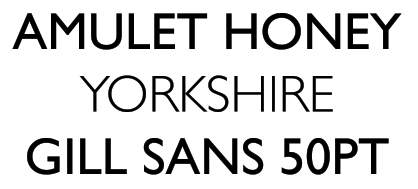
However when using the light for the place name I think it looks alot better very clean and easy to read.

Nice type but feel it will look stretched out when on the packaging and not the most suitable typeface for my product.

The options with Big Noodle was regular and italic but I don't think the italic for the name does the product any favours.

The type is bold. Probably to serious though. I also think it is harder to read than the previous typefaces for some reason.

Just exploring what it would look like if I made the place bold and the brand regular. I think there are other ways to make the place stand out using colour.

This type looks similar to typewriter and it is against the natural world mechanical machine.

The Amulet honey is what I want people to recognize but I want something where people can tell the different products of honey from the locations, locations were favoured better the the other ranges I suggested from the survey. Like the bold type and the next subject is regular it makes the reader read the brand then where the location is.

Trying typography for Amulet honey, type looks nice and with honey within the name it gives away what the product is.
No comments:
Post a Comment