 Experimenting with shapes and how it can fit on the packaging. Mainly hexagons to communicate the bee home, hives. Also looking at hand drawn type how can that fit on the products
Showing posts with label Experimental. Show all posts
Showing posts with label Experimental. Show all posts
Monday, 15 November 2010
Hand-drawn
 Experimenting with shapes and how it can fit on the packaging. Mainly hexagons to communicate the bee home, hives. Also looking at hand drawn type how can that fit on the products
Magazine
 Attempting layouts and ideas for magazine spreads for the advertisement of the honey range. I have tried to produce ideas for hand drawn illustrations influenced from Lilys dog food packing within my DC blog.
Monday, 8 November 2010
Toast

I left the bread to toast and this was the outcome... Maybe need to look into developing the idea more.

Butter the stencil with bread underneath.

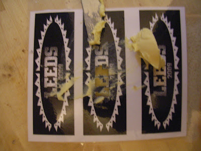
The type for the experiment I am doing for Leeds festival is very small and hard to cut out so just tried it with LEE.

An idea for festival promotion- Burn the toast using a stencil to communicate the logo of the event or also the logo of the honey brand.
Flyer - Fold

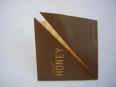
Close up of printed flyer, tried to fold the edges of the flaps but there was no hope of keeping the flyer held together maybe think of a different method to hold the flyer together.

Printed flyer opened up, could also have information about products ect printed on the back.

Printed folded version - the only problem with this flyer is that the flyer opens up its not down in place.

I have made the hexagons smaller and also changed the colours around to make it look more like a honey product. I have also added my brand name and company website.

The Hexagons have now been rotated so that it goes inline with the black triangle. However I feel that the hexagons are to big so maybe put some more in and make the image smaller

This image shows the edge of the division of black and hexagons is not in line with each other.

I have changed the opacity so its low at the top right and gets higher towards the bottom left the communicate the hexagon more

Again this is another screen grab of the random lowered opacity for the triangles.

Randomly lowering the opacity on different triangles to make up the hexagon shape but it looks more like triangles rather than the overall hexagon

Experimenting with spot colours to reduce the costs of printing. I am trying to play around with the opacity and also hexagons which you find in a bee hive.
Typography for Bees

If you click on the image it looks alot better. Maybe instead of the drop shadow it could be printed on yellow stock and blown up to A3 so the type looks easier to see. This was only an experiment I wanted to do a few different approaches with this work so it is something that I can always build on for future projects.

Was meant to be Float like a butterfly not fly like a butterfly. The rest of the quote was one of my friends was randomly said it the other day so I thought I would use this quote to see wether of not the letters work together.

Quick mess around with a line as a drop shadow set off randomly to the letter. Could work is balanced with the same marks as the letter form. Copy paste and move a fraction to the side and live paint in yellow.

This experiment looks alot better very subtle but communicates what I want to say not sure if it would work the same with all the letters.


This experiment with the highlights communicates to much what the type is meant to communicate

The above image is again experimenting with highlights but again looks over the top

The above image shows the original image as well as the experimenting highlights to see visually on screen what works better

The vector and live trace from illustrator gives it that hand drawn but alot clean look to it.

Finished Typeface - Looks better when zoomed in so if you click on the image you'll see it alot clearer

A close up of the progression made from the original typeface to the illustrated type.

When illustrating the letters I noticed that the overall form was quite thin, this was Letter Gothic Bold, so I had to make each bar of the letter forms thicker.

Letter Gothic Standard A-Z, I have used this typeface because it is the same font I have been using for the rest of my work.

Highlights of the cat. Same mark-making but place top right of each letter form. When producing a typeface think about other places to have the highlights of bee, stripes, behind, drop shadow or just printed on yellow stock?

Close up image of the details, the fur of a cat is alot thinner than a hairy, fluffy bee. When producing typeface it will need to be thicker to communicate the thick hairs.

Some typography I saw and want to play around with the idea for bees.
by PantOne
Tuesday, 2 November 2010
Clover

A random experiement playing around with inverting all the colours the image looks really interestig but doesn't commuincate anything I am trying to put across to the audience.

Reduced the opacity of the hexagon and it is not to dominate for the image

Quite like this image the hue has been slightly changed it shows off the rich purples from the clover but the sky looks abit out of place

Lowered the opacity on the black hexagon and the image flows even better but again doesn't show of the rich clover colours.

I have now de-saturated the image and it flows alot better, but it doesn't communicate the rich clover colours.

Trying it again in black and white with the smaller hexagon

Moving the hexagon and type smaller because before it looked clumbsy

Just wondering what it would look like with black text and a white hexagon, I think the black and white look to strong for the image.

From the wrap it up brief I have gone back to the hexagon but it now looks very similar to the image of influence

It looks finished with sky in the image not sure if all the colours flow together, could do with a de-saturation

The image looks better with the name at the bottom of the image because when you look at the page you look from the top of the image down to the black box at the bottom

After looking at the image of influence from my design context blog, I have noticed that the images have been duplicated and used a few times in the image they are not all the same mountains.

Image without rulars. Think the flag lets the image down.

Response to forgotten-hopes.com I thought I'd try to do something similar for an image to use within the promotion of the product. The image contains a collage of images of clover as clover will be one of the five monofloral honey products out of the five honeys, to see what it would look like.
Subscribe to:
Posts (Atom)
