Showing posts with label Logo. Show all posts

Monday, 15 November 2010

Logo Continued


Quick Mock up ideas for logo on the computer. From research alot of companies use the letter E as the bee. I have tried to use the letter o instead to be a bit different obviously the e would work better with the bars and stripes but O could give the body of the shape of the bee. Really like the type used as well Letter Gothic.

Logobro


the above images are influenced by the Waitrose and other brands of honey where they use a letter to represent the Honey. I think the above images however looks clumsy because of the size of the Amulet brand name. I think it works well to the right hand side but maybe make abit smaller.

Logobro

Tried to see what the logo could look like with a more hand drawn look but using fonts off the mac it looks poor the best idea is to produce my own type and import it, using a pencil so it gives it marks aswell so it's not to clean.

Hand-drawn

Experimenting with shapes and how it can fit on the packaging. Mainly hexagons to communicate the bee home, hives. Also looking at hand drawn type how can that fit on the products 

Logo fits on Packaging?

Exploring ways how the logo can fit on the glass jar or be applied to other methods of packaging. Also at the bottom I have looked at producing the logo as a hand-drawn as this is an alternative to the type based logo from the computer to give it a more natural look.

Amulet Honey

Trying out logo with imagery to to that it represents bees more. The idea was to change the letter o into the body of the bee with wings and head above it doing this I have to consider where the brand name Amulet sits next to it. The Logo at the bottom trys to represents the typeface I made to show the texture of the bee but I think the above logo suits the product and audience better than the bee textured type logo.

Tuesday, 2 November 2010

Finalizing Logo

Like the logo but maybe some black stripes to break up the yellow may work better? Try this out when testing for products.
The yellow and black does relate and communicate bees but not sure if both should be yellow or a black and yellow?
The white areas lacked colour and empty the black doesn't communicate bees though.
I know the honey is the third thing you look at but looks alot more balanced.
The bold Letter gothic works well with the thickness of the logo, bold so stands out
Type works better on each line but type is not strong enough for the logo. I like the position of the type how it fits in the logo.
The logo represents the figure eight of the bee dance as I think just type makes the product look to basic and will add identity
Figure of eight- the scout bees dance to communicate to the rest of the workers how far and which direction the honey is

Amulet Honey

By making the Amulet bold it stands out as the first thing you read but the size of it against the other text might look clumsy. It reminds me of absolute vodka as well
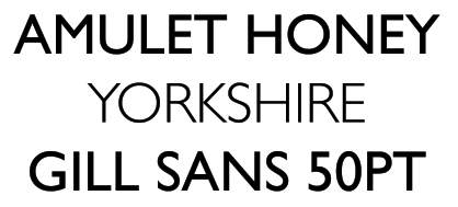
Trying the brand name and place name separately as this is what could potentially happen on the packaging
However when using the light for the place name I think it looks alot better very clean and easy to read.
Nice type but feel it will look stretched out when on the packaging and not the most suitable typeface for my product.
The options with Big Noodle was regular and italic but I don't think the italic for the name does the product any favours.
The type is bold. Probably to serious though. I also think it is harder to read than the previous typefaces for some reason.
Just exploring what it would look like if I made the place bold and the brand regular. I think there are other ways to make the place stand out using colour.
This type looks similar to typewriter and it is against the natural world mechanical machine.
The Amulet honey is what I want people to recognize but I want something where people can tell the different products of honey from the locations, locations were favoured better the the other ranges I suggested from the survey. Like the bold type and the next subject is regular it makes the reader read the brand then where the location is.
Trying typography for Amulet honey, type looks nice and with honey within the name it gives away what the product is.

Amulet

Could the logo be something as simple as the bee I used for the wrap it up brief. Clear understandable and communicates what needs to be said.
Breaking up the hexagon into a cube this has potential to play around with three different surfaces but I'm not a fan of having text of images viewed as perspective.
Tried to use the bee on top of the cube but doesn't work, looks out of place.

Instead of importance I'm trying the word I found when researching bees, Amulet this means protects someone or something from trouble and I also think this is relevant to the decrease of bee numbers, as through selling more honey this will require more bees to produce honey.
Tried Amulet in capitals but the size of the image and text seem to big, clumbsy.

Rough Ideas

Play around with the hexagon shape for the logo or to use within the packaging.
The logo has to include a brand name and also the place from where it is from clearly labeled
Maybe the place is highlighted using different colours to make it recognizable on the packaging when next to each other

A few rough ideas for the tube for the honey to go inside. Using skyscrapers to show the area where the honey comes from. Illustrated bottle of the method and cycle of producing the honey, and how the text layout may make a difference in the design.

Monday, 1 November 2010

Company name

Below are a few examples of experimenting with typography. I want something clean, easy to read which can communicate to consumers the this belongs to this brand because of the clear logo's identity.
Futura - usually I have the logo in capitals to make it bold but above I have tried to have no capitals to see what it looks like. I think the logo works well not to strong but that might be a disadvantage when consumers are looking at other products on a stores shelf.
Futura- Moving blend to the next line to see if the composition works better but I prefer it on one line, as the p from special and b and l from blend look unbalanced.
Futura- With capitals at the start of the words, it makes it look less attractive I think.
Futura CAPS- The capitals make it look really strong bold and would be something you read first on the packaging and would be a good contender when looking at the other honey range products.

Abadi MT Conden- Typography is bold but not really to playful.

Orator STD - Like the spacing between the letters, not sure if it would work as well on a honey product as it looks like a typewriter font.

Letter Gothic STD - The typography is really nice. I think the CO. is out of place maybe move to its right or make smaller. The typeface has character!
Letter Gothic STD - The above logo was influenced by the image above but the dot after company looks out of place.
Letter Gothic STD - The above logo communicates the image above I want to reflect the logo composition as and works alot better without the dot. More Balanced.